We are getting ready for trade-show season here at Golioth. We will be at the Zephyr Developer Summit next week and Embedded World later in the month. We’re excited to be able to show off some of our capabilities live and in person!
Showcasing data in a cogent way is a key component to IoT deployments. As a hardware developer, the “atoms” (hardware implementation) are the fun part to work on, but the “bits” (data implementation) are how you get the message across. This isn’t just for trade shows. Your clients, co-workers, and customers are all going to want to see what kind of useful data is being generated by your IoT system.
Today, let’s dig into how you might want to showcase “real-time” versus “historic” data. We are using Grafana for our data dashboard, and there are some interesting differences in how you configure and show the data to users.
Configuration Differences
We have written about and showcased Grafana before. It’s an “observability platform” that helps chart data. Normally it targets monitoring infrastructure like servers and cloud implementations, but it’s also possible to use Grafana for IoT systems. We like it because there is a hosted cloud version (which we use for this demo), and it can also be deployed locally in a container.
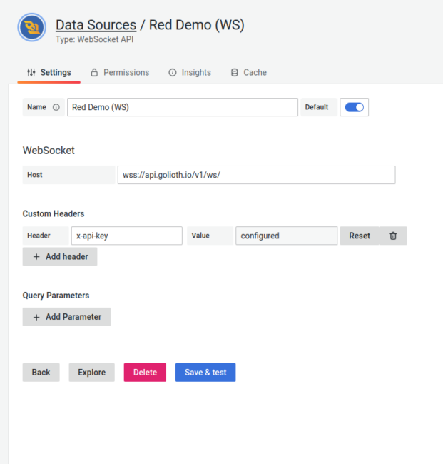
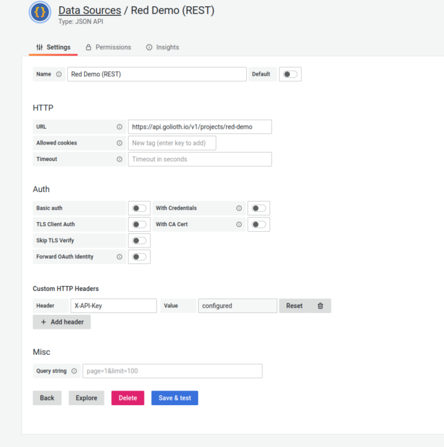
We are interacting with Golioth data in two different ways: using WebSockets for Real-time data and using our REST API for Historical data. For the former, we actually wrote and published a WebSockets plugin for Grafana. This allows us to monitor when there are changes to variables, both on LightDB State and LightDB Stream. For more information on getting this set up, Mike has written an in-depth tutorial on how to hook up a sensor and get it transmitting data using WebSockets.
In my case, I’m monitoring temperature data on an OpenThread demo that we are showcasing. There are 3 different devices transmitting their sensor data back to Golioth. Once that data is in the Golioth cloud, I have two different “data sources” set up in Grafana to extract that data for later viewing.
Real-time data via WebSockets plugin:
Historical data via JSON API plugin:
Why the data source difference?
Now that we have covered some of “how”, let’s talk about the “why” of showing real-time vs historical data. Can’t we just use the same data source for both?
In short, no. Or you could, but it will make things difficult.
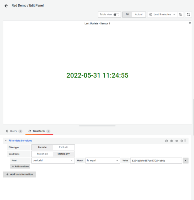
The key thing to think about is how much data we’re trying to show for each. In the image below, we’re showing the most recent value and when it was update in the two left panes. This is the “real-time” component. All you need to gather is the latest data point.
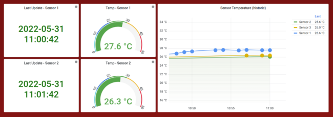
For the “historic” chart, we actually want to go backwards in time and fetch a range of values. The line chart’s legend also shows “last” value for each of the 3 sensors, but note that they don’t match the left side dials. That’s because the line chart shows the “last” reading from when the chart was fetched, which happens every 15 minutes. The dials themselves display the most recent reading, live streamed to the dashboard.
In the data source configuration screenshots, note that the two endpoints on Golioth are different. In the case of the JSON API plugin talking to the REST API, we are actually calling out the project name. When we do a POST to the LightDB Stream endpoint (/stream), we tell the API which data range we want to go fetch. This allows us to gather all data points within a pre-defined range. This is the basis of the “historical” measurement.
If we were trying to do gather the same data with the WebSocket (charting data on a time-series graph), we would only be able see the data on the graph for as long as we were capturing output from the WebSocket. For instance, if we reload the page, the chart would no longer have any data points on it, until we start capturing newly generated data points. There is no capability to go and pull historic data from the WebSocket endpoint.
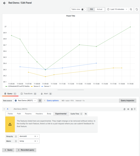
The JSON API data source has an additional element that is helpful for charting time-series data on a graph: it allows grouping data by one of the columns, in our case the device name. Below I have also added a label to Sensor 1 and Sensor 2, with the last sensor not yet labeled.
This is something that could be implemented in the WebSocket data source in the future, but it doesn’t do that currently. Instead, on the “dial” and “stat” panels shown above, we ingest all data coming from the WebSocket (representing all LightDB Stream data from our project, from all devices) and then filter that data to only show the specific device we want represented in the visualization:
Setting up your next project
There are a wide variety of ways you can set up your projects to showcase the data being generated by devices in the field. It’s good to start by asking yourself: what do you want out of the data?
Do you want to be alerted to the most recent data point? You might want something like the dial shown above, including mapping colors around expected values. You can also set up alerts in Grafana to trigger as you move past certain thresholds.
Are you looking to see how things are changing over time? That might make more sense to target a “historical” view, like a line chart pulling from the Golioth REST API. This allows you to understand what your device has experienced in the past and potentially take action based on one-time events, such as a spike in data.
Or maybe you care more about how things are trending? You can always gather multiple data points and then apply statistical methods to them. This might help smooth out spikes in data and only show the median or mean of data over a defined time period. Applying statistical methods could work for either the Real-time or Historical data, but would have the same caveat of only capturing the data you are actively observing via the WebSocket endpoints.
However you decide to slice and dice your data, it’s important to understand the a capabilities of outputs from the Golioth platform and your visualization platform. We will continue to publish about our own dashboards and other ways we find to help our users visualize their data.
Photo by Brett Sayles from Pexels
No comments yet! Start the discussion at forum.golioth.io